MANUEL RITZ

IO DONNA SCHEMA LIBERO – MILANO IN GRANDE STILE

14-MODA-R-defschema-libero_Storia7

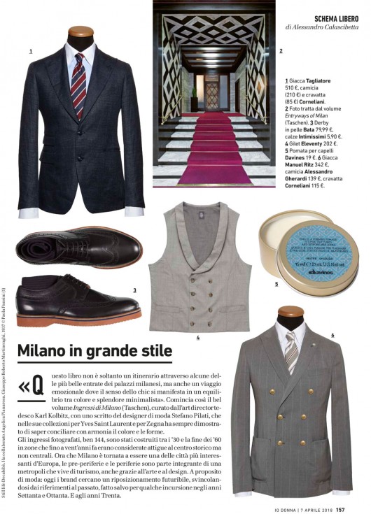
Triumphant Milan. “This book is not only an itinerary through some of the most beautiful entryways of Milan’s buildings, but also an emotional journey where the sense of chic lies in the balance between color and minimalist splendor”. This is the beginning of the book Entryways of Milan (Taschen), edited by the german art director Karl Kolbitz, with a writing of the fashion designer Stefano Pilati, that in his collections for Yves Saint Laurent and Zegna has always proved that he knows how to conciliate with balance colors and shapes. The entryways photographed, no less than 144, have been built from the 30s to the end of the 60s in areas that until 20 years ago where considered adjacent to the historical centre but not central. Now that Milan is one of the most interesting cities in Europe again, the suburbs are an integral part of a metropolis that lives of tourism, thanks also to art and design. Talking of fashion: today brands look for a futuristic placement, releasing from past references, apart from some intrusions in the 70s and 80s. And the 30s.

IO DONNA SCHEMA LIBERO – IL BUON GUSTO

41-MODA-R-ok_Storia7

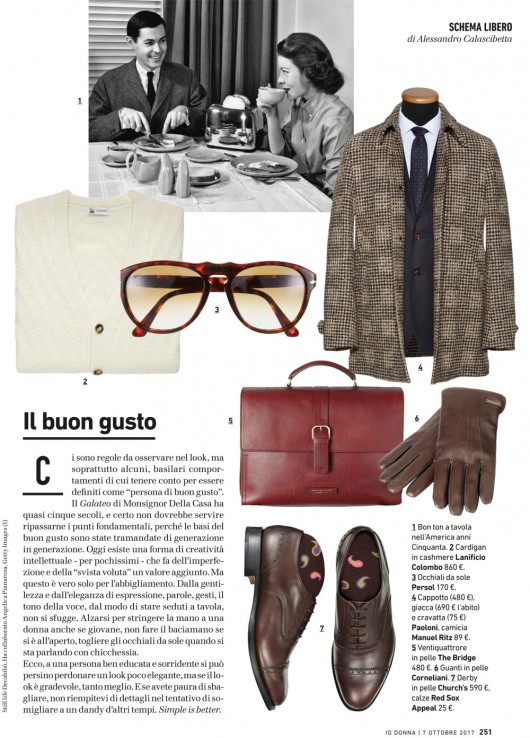
The Good Taste. There are rules to be respected, and mainly some basic behaviours to be considered in order to be defined as “good taste person”.  The Galateo of Monsignor Della Casa has been written almost five centuries ago, and there is no need to review the key points, because the rules of good taste have been handed down from one generation to another. Today there’s a kind of intellectual creativity – only for very few people- that makes the flaws and the “intentional oversights” an added value. But this is valid only for clothing. We can’t excape from kindness, elegance of speaking and good manners. Standing up to shake the hand of a woman even if she’s young, don’t kiss on the hand if outside, taking off the sunglasses while talking with anyone. Well, we can forgive a smiling and kind person if he/she is not properly dressed, but if the attire is elegant, much better. And of you are worried of making mistakes, don’t add details and details trying to look like a dandy from old times. Simple is better.

SCHEMA LIBERO GEOMETRIE

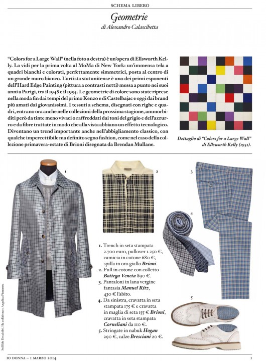
Geometries. “Colors for a large wall” (in the picture) is an artwork by Ellsworth Kelly. I saw it for the first time at the MoMa in NY: a huge painting with perfectly symmetrical white and coloured checks, placed in the middle of a wide white wall. The American artist is one of the first figures of the Hard Edge Painting, developped during his years in Paris, between 1948 and 1954. Colour geometries have been used in fashion by the early Kenzo and Castelbajac, and today by brands loved by young people. Those fabrics, printed with stripes and checks, are included in the s/s collections, but softened by pastel colours or cooled by grey and blue shades and fibres that look technical. They are an important trend in classicwear too, but with some imperceptible but clear fashion sign, as in the case of the Brioni s/s collection by Brendan Mullane. Detail of “Colors for a Large Wall” by Ellsworth Kelly (1951)

SCHEMA LIBERO ANTE OZPETEK

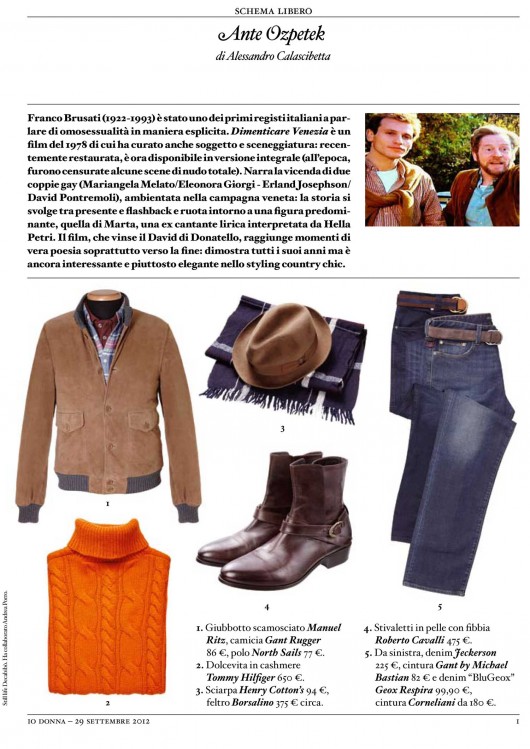
Franco Brusati (1922-1993) has been one of the first italian film directors treating homosexuality as an open matter. He was the directon and screenwriter the 1978 movie “To forget Venice”, which it’s just been restored and released uncut.(At that time a few full-frontal scenes have been censured). The movie is about this two gay couples (Mariangela Melato/Eleonora Giorgi – Erland Josephson/David Pontremoli) in the Veneto countryside. The story developes between past and present and the main character it’s the ex lirical singer Marta ( Ella Petri). The movie won a David di Donatello Award and it reaches some points of pure narrative poetry especially towards the end, it is a dated movie, but still very interesting and quite elegant, with that country chic styling.