io donna

IO UOMO – OLTRE IL NERO

46-iO_Uomo_Storia10

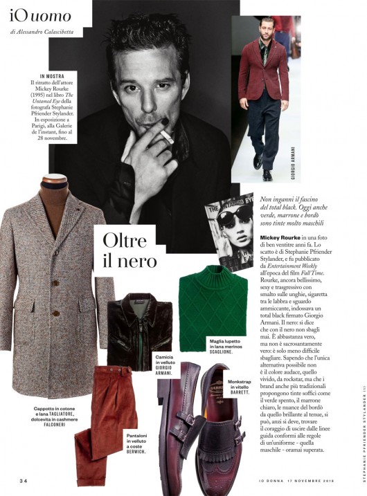
Beyond black. Mickey Rourke in a shot of 23 years ago by Stephanie Pfriender Stylander, published by Entertainment Weekly when the movie Fall Time was out in cinemas. Rourke, still handsome, sexy and transgressive, with nail enamel, cigarette and alluring gaze, was wearing a total black look by Giorgio Armani. Black: it is said that you never go wrong with black. It is almost true, but not completely: it’s just less easy to fail. Considering that the only possible alternative is not the bright, showy color, for rockstars, but even the most traditional brands suggest soft shades like dull green, light brown, burgundy, it’s possible (well, it’s a duty actually) to find the courage to abandon the guidelines compliant with rules of a way of dressing that’s obsolete by now.

IO UOMO – TARTAN MANIA

42-iO-Uomo_Storia10

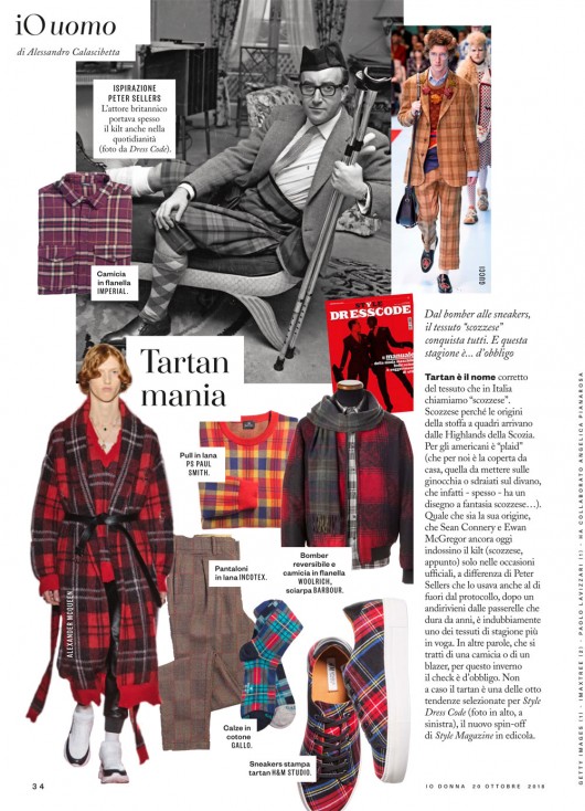
Tartan Mania. Tartan is the typical checked fabric born in Scottish Highlands. Americans call it “plaid” (that for us is the blanket we use at home, on the knees, laying on the sofa, that, indeed, – often – has a checked pattern…). Whatever its origin may be, though Sean Connery and Ewan McGregor wear the kilt in official events, differently to Peter Sellers that wore it even out of the etiquette, after its coming and going on the catwalks, now it’s one of this season’s most fashionable fabrics. In other words, whether in form of a shirt or a jacket, this winter tartan is a must. It is not by chance that it’s one of the eight trends selected for Style Dress Code (above, on the left) the new Style Magazine’s spin-off.


IO DONNA SCHEMA LIBERO – LA SIGNORA IN ROSSO

20-MODA-R-schema-libero_Storia8

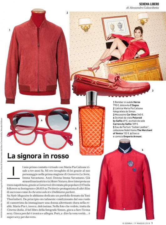
The woman in red. My first virtual contact with Maria Pia Calzone was three years ago. I took a fancy to her thanks to her character in the first season of Gomorra the Series, Imma Savastano. She had already been great in Mater Natura, where she interpreted a Neapolitan transsexual, but thanks to Gomorra she has become more popular (117k followers on Instagram and 26615 on Twitter) and protagonist of other successful movies like Io che amo solo te and Dobbiamo parlare. Style Magazine dedicated to her a portfolio signed by Toni Thorimbert. At first I was so influenced by her camorrista character that I imagined a woman as tough in real life. But Maria Pia is really sweet, actually. In this picture, taken from Cinema Italia, the great book by the photographer Simon, she plays the role of the sexy icon. She plays, because she’s ironic and funny. But, to tell the truth, she’s sexy indeed.

IO DONNA SCHEMA LIBERO – M COME MODA

17-MODA-R-schema-libero_Storia7(1)

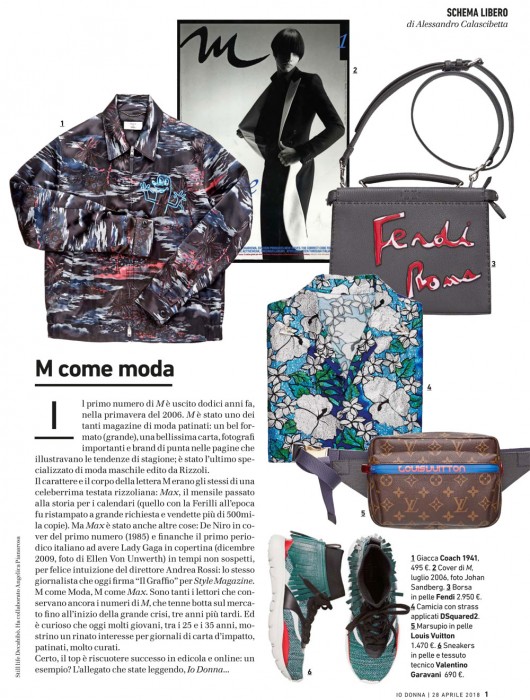
M like Mode. The first issue of M was published twelve years ago, in spring 2006. M was one among many glossy fashion magazines: nice size (big), high-quality paper, great photographers and important brands for pages that showed the season’s trends; it was the last fashion specialized published by Rizzoli. The type and font of the letter M was the same of a very popular RCS magazine: Max, the monthly publication well-known for calendars (Ferilli issue was reprinted and sold more than 500thousands copies). But Max was many other things: De Niro on the cover of the first issue (1985) and the first italian magazine to have Lady Gaga on the cover (december 2009, picture by Ellen Von Unwerth) back when no one would have imagined, thanks to the intuition of Andrea Rossi: the same journalist that today writes “Il graffio” for Style Magazine. M like Mode, M like Max. Many readers conserve M issues still today, that hung in there since the beginning of the great crisis, three years later. And it’s interesting to notice that today many young people, between 25 and 35 years old, show a real interest for paper magazines that are high-impact, glossy, very well-finished. But the best thing is to be a success both in paper and online publications: an example? The supplement you are reading, Io Donna…

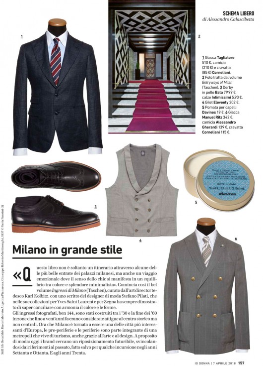
IO DONNA SCHEMA LIBERO – MILANO IN GRANDE STILE

14-MODA-R-defschema-libero_Storia7

Triumphant Milan. “This book is not only an itinerary through some of the most beautiful entryways of Milan’s buildings, but also an emotional journey where the sense of chic lies in the balance between color and minimalist splendor”. This is the beginning of the book Entryways of Milan (Taschen), edited by the german art director Karl Kolbitz, with a writing of the fashion designer Stefano Pilati, that in his collections for Yves Saint Laurent and Zegna has always proved that he knows how to conciliate with balance colors and shapes. The entryways photographed, no less than 144, have been built from the 30s to the end of the 60s in areas that until 20 years ago where considered adjacent to the historical centre but not central. Now that Milan is one of the most interesting cities in Europe again, the suburbs are an integral part of a metropolis that lives of tourism, thanks also to art and design. Talking of fashion: today brands look for a futuristic placement, releasing from past references, apart from some intrusions in the 70s and 80s. And the 30s.