Davide Cernuschi

SETTE MAGAZINE EN VOGUE GUARDA CHI SI RIVEDE LA CRAVATTA DI VELLUTO

Every passing decade leaves different shapes of clothes behind. In the past I already wroteabout the beauty of knowing how to mix and matchvintage with modern pieces, even suggesting fabrics and trends that we haven’t seen in a while. Of course, there’s always something that cannot be proposed ever again, like the Varty and Cleaver’s typical nuance of white (the couple of designers who has made Byblos glorious in the 80s), that was their signature sign in an ideal world, where we would have the chanceand the space to preserve our clothes in perfect conditions, one should never get rid of their pieces!The latest kaleidoscopic fashion shows are pushing the bouderies, in favour of creativity. A great example of repechage would be ashirt in a very light and soft corduroy fabric with a smooth velvet tie, so that their rubbing against eachother wont reduce the natural movement of fabrics. Since velvet is quite a thick material, the jacket to wear should be made in a lighter fabric as a consequence. Perhaps a wool crepe or a silk and wool blend one. And maybe who knows even the white ankle lenght longcoat could always make its comeback..

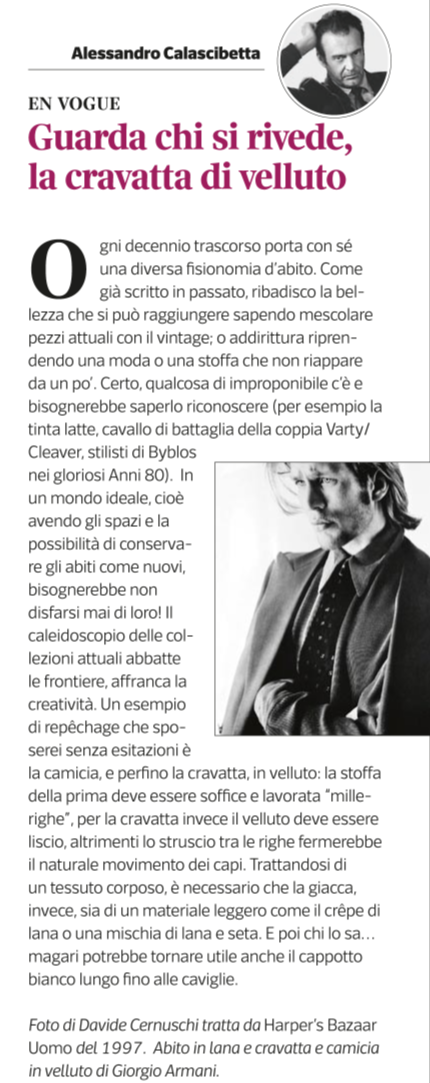
Image by Davide Cernuschi, from a 1997 Harper’s Bazaar Uomo issue. Woolen suit, velvet shirt and tie by Giorgio Armani.

SETTE MAGAZINE EN VOGUE VESTIRSI BENE DIVENTA ANTIDOTO ALLA CRISI

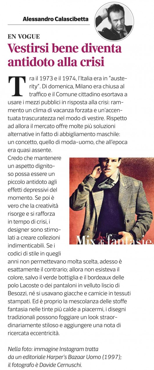
Between 1973 and 1974 Italy was facing a period of “austerity”. On sundays, in Milan the traffic used to be blocked, the municipality was pushing people to use public transports as an anti-crisis measure: I remember the forced holiday atmosphere and the scraffy way of dressing. Nowadays, there are many alternative solutions in menswear which at that time was almost a non-existing concept. I believe in maintaining a proper appearance as an atidote to this general depressing mood. If it’s true that creativity rises again strenghtened by crisis, then designers are being pushed to create some really epic collections. If at that time style wasn’t giving men much choice, today the situation is radically changed.; There were not many colours in menswear before, a part from the bottle-green and the classic reddish-brown of the polos by Lacoste and velvet trousers by Besozzi. Not even printed jackets and shirts were in use. I love the beauty of mixing and matching warm shades on printed fabrics, traditional designs can be extremely stylish and also add an elegant, unconvetional touch. Picture taken with Instagram, the original photo is by Davide Cernuschi, from an Harper’s Bazaar Uomo editorial, 1997.

SETTE MAGAZINE EN VOGUE. SE LA FOTO ONLINE AUMENTA IL FATTURATO

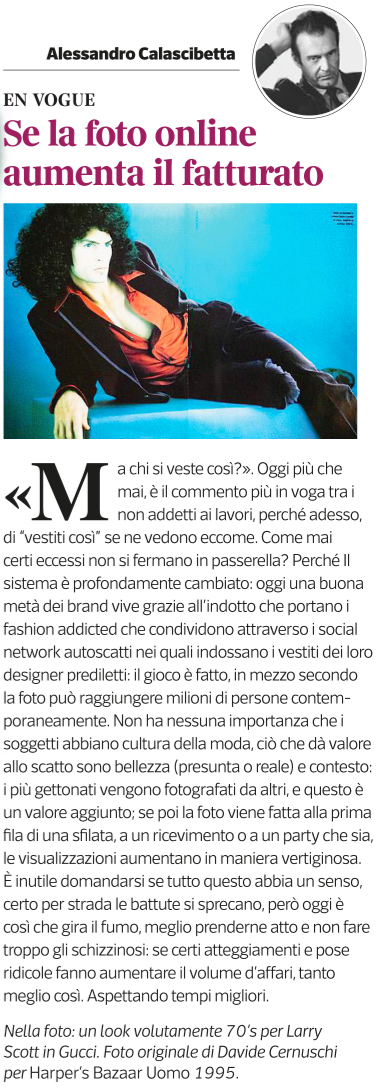
“Who is ever going to wear that?”. Now more than ever the most popular comment between non-fashion insiders, because today we see a lot of people wearing “that”. Some excesses aren’t strictly catwolk-related anymore, why? Because the system is deeply changed: today a good half of the brands, is gaining profit from the self-portraits of tons of fashion addicts with their favorite designer’s pieces on and sharing them on the social networks. That’s it, through this media the picture can reach millions of people in half a second.It doesn’t even matter if the sobject actually do know anything about fashion or not, the value of the picture resides in two main features: beauty (real or assumed), and contest: the most popular shots are being taken by others, because that is a plus. If , on top of that, the picture is being taken at the front row of a fashion show, party or similars it can get a huge amount of views. It’s useless to wander if all of this makes any sense, because this is how things work now. It’s just better to get used to it and try not to be too queasy: If certain attitudes and laughable poses help to boost sales, it’s all good. Waiting for better days.

SETTE MAGAZINE EN VOGUE. VENTI ANNI DI LOGO. MEGLIO NON ABBONDARE

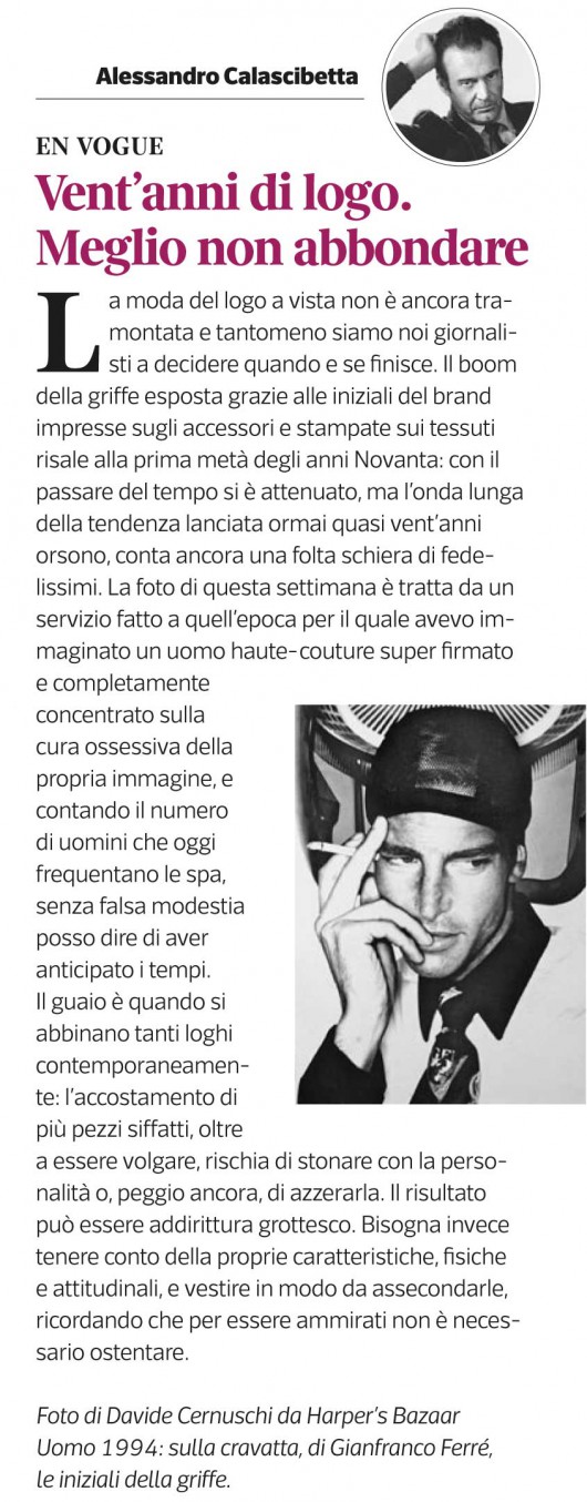
The tendency of showing off designer’s logos is not over yet and is not even up to us journalists to put an end to it. The boom of displaying the initials of a brand printed all over accessories and fabrics begun in the mid 90s. As the time went by that wave slowly faded away, but still counts a large a mount of followers. This week’s photo is from an editorial I realized at that time, imagining a self-obsessed haute-couture man covered up in designer pieces from head to toe.Without any false modesty, I can state that considering how many men nowadays are regularly going to the SPA, I was being ahead of our time.The problem arises when you mix and match to many logos at the same time: the combination of this kind of pieces other than being vulgar it may clashes with one’s personality, or worst, it might erase it. The result can also be grotesque. We should always consider our body feautures and personality and remember that is not really necessary to show off in order to be admired.

HARPER’S BAZAAR UOMO 1994

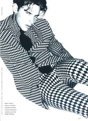
Ph. by Davide Cernuschi, total look Gianni Versace. Una delle ultime collezioni firmate da Gianni Versace. Come da sua consuetudine, il genio della provocazione aveva attinto dal mondo femminile per proporre appunto l’optical. Esattamente un anno dopo aveva ripetuto l operazione anche sulla linea maschile Versus.

Total look Gianni Versace. One of his last collections. As a genius and provoker, he used to steal from the feminine world and proposed the “optical”. One year after, he did the same thing for his menswear line Versus.