brioni

SCHEMA LIBERO ECLETTISMI

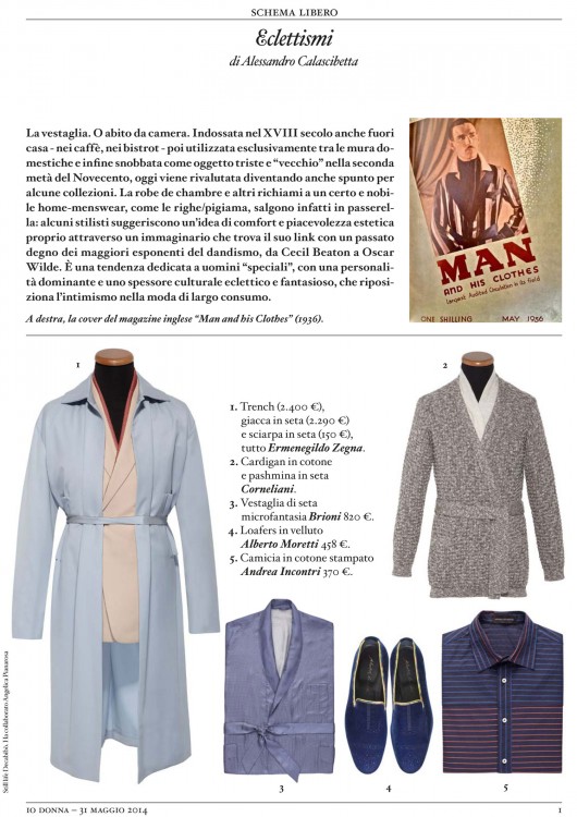
Eclecticisms. The dressing gown. Worn in the 18th century in cafes and bistrot, then used only at home, and finally snubbed as a dismal and “ancient” garment in the second half of the 20th century, today it has been reevaluated, becoming a strating point for some collections. The robe de chambre and other recalls to a certain noble home-menswear, like the pajamas’ stripes, are infact on the catwalks: some designers suggest an idea of comfort and beauty linked to the main exponents of dandyism in the past, from Cecil Beaton to Oscar Wilde. This is a trend dedicated to “special” men, with a leading personality and an eclectic and creative cultural depth, that places intimism in consumer fashion. On the right, the cover of the UK magazine “Man and his Clothes” (1936).

SCHEMA LIBERO BRAND’S STORY

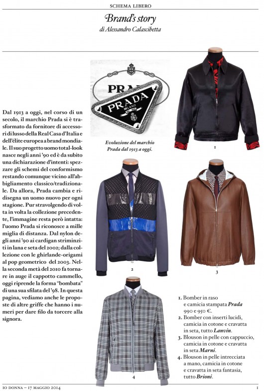
From 1913 till today, during last century, the brand Prada has been changed from the supplier of luxury accessories of the italian royal court and the european elite to a worldwide icon. Its menswear’s total-look project was born in the 90s and it is a declaration of intent from the start: breaking the rules of conformism staying true to a classic/traditional clothing at the same time. From then on, Prada keeps on changing and designs a new man every season. Even if it overturns the previous collection everytime, the concept remains intact: the Prada man is recognisable from miles away. From nylon clothes of the 90s to skimpy cardigans made of silk and wool of 2002; from the collection with origami-garlands to geometrical pop of 2003. In the second part of the 2010s there’s a return of the camelhair coat, today there’s a return of a “rounded” shape of a ’98 show. In this page, there are looks of other brands that can give a hard time to Mrs. Prada.

SCHEMA LIBERO PENSIERO DIVERGENTE


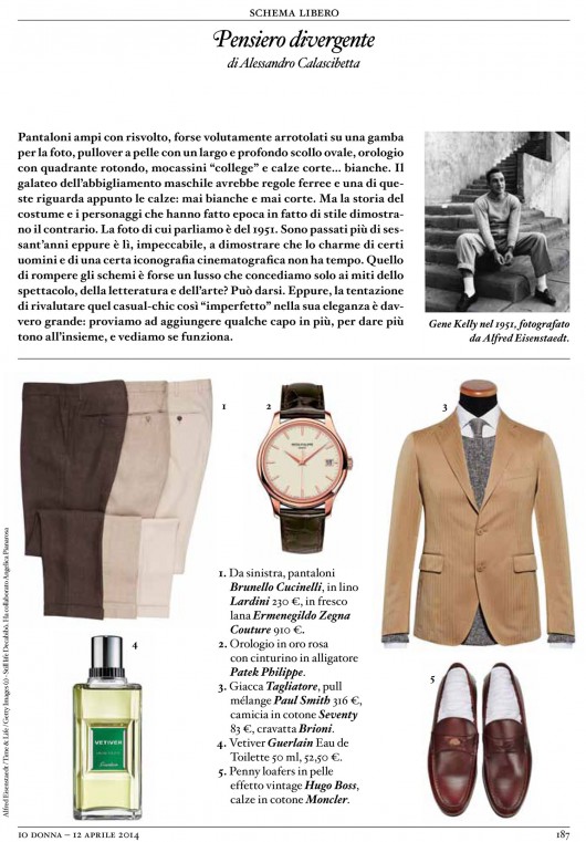
Divergent thinking. Wide trousers with turn-up, maybe intentionally turned on a leg for this picture, pullover with a wide oval neckline worn on the bare skin, watch with a round clock face, penny loafers and…white, short socks. The etiquette of menswear has very strict rules, and one of them is about socks: they mustn’t be white nor short. But history of fashion and style icons prove just the opposite. The picture we are talking about is from 1951. More than sixty years have passed by, but this is here, flawless, to show us that the charm of some men and of a certain movie iconography is timeless. Is breaking the rules a luxury allowed only to movie, literature and art stars? Maybe. But the temptation to revalue that casual-chic look, which is so “imperfect” in its elegance, is really strong: try to add some garments, to set the tone of the outfit, and see if it works. Gene Kelly in 1951, picture by Alfred Eisenstaedt.

SCHEMA LIBERO GEOMETRIE

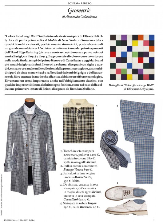
Geometries. “Colors for a large wall” (in the picture) is an artwork by Ellsworth Kelly. I saw it for the first time at the MoMa in NY: a huge painting with perfectly symmetrical white and coloured checks, placed in the middle of a wide white wall. The American artist is one of the first figures of the Hard Edge Painting, developped during his years in Paris, between 1948 and 1954. Colour geometries have been used in fashion by the early Kenzo and Castelbajac, and today by brands loved by young people. Those fabrics, printed with stripes and checks, are included in the s/s collections, but softened by pastel colours or cooled by grey and blue shades and fibres that look technical. They are an important trend in classicwear too, but with some imperceptible but clear fashion sign, as in the case of the Brioni s/s collection by Brendan Mullane. Detail of “Colors for a Large Wall” by Ellsworth Kelly (1951)

SETTE MAGAZINE EN VOGUE AL MASCHIO S’ADDICE IL LUSSO DISCRETO

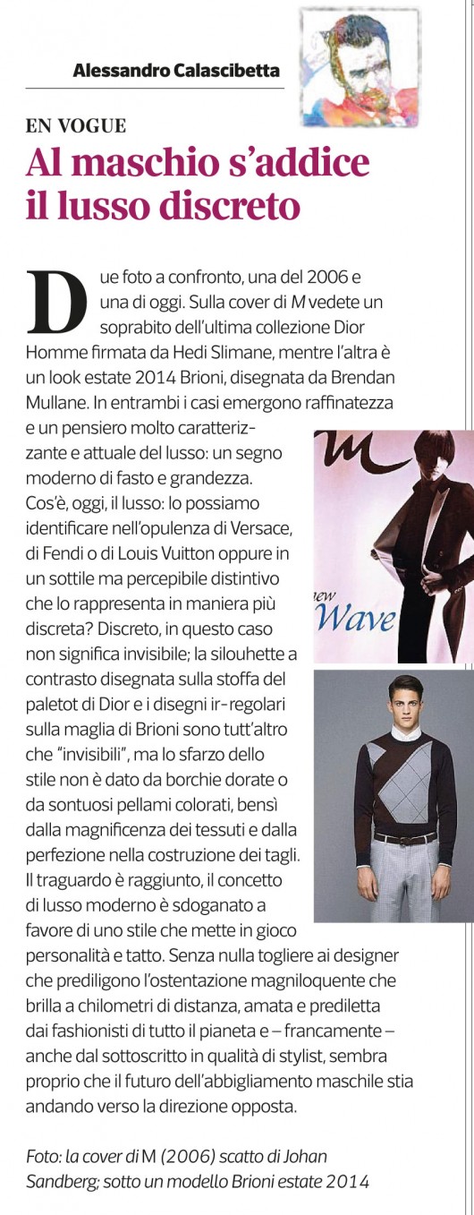
Discrete luxury for men. Two pictures, one of 2006 e one of today, in comparison. On the M cover you can see a coat from the last Dior Homme collection designed by Hedi Slimane, while the other shows a look from the Brioni’s ss 2014 collection, designed by Brendan Mullane. In both cases we find refinement and a very distinguishing and up-to-date thinking of luxury: a modern sign of splendor and greatness. What is, today, luxury: can it be the opulence of Versace, Fendi and Vuitton or a subtle but perceivable particularity that represents it in a more discrete way? Discrete, in this case doesn’t mean invisible; the contrasting silhouette drawn on Dior coat and the ir-regular motif on Brioni’s sweater are anything but “invisible”, but the richness of style is not made of golden studs or sumptuous coloured leather, but of very fine fabrics and perfect cuts. The goal has been achieved, the concept of modern luxury is legitimized through a style that involves personality and tact. Without devaluing the designers who prefer ostentation, loved and preferred by fashionistas all over the world and – honestly – by me as a stylist, it seems that the future of menswear is going to take the opposite direction. The M cover (2006) shot by Johan Sandberg; below a ss14 Brioni outfit.