SCHEMA LIBERO FUNKY WEATHER


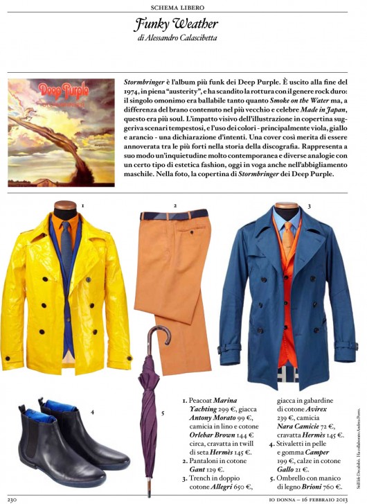
“Stormbringer” is the funkiest Deep Purple’s album. It came out at the end of 1974 in full “austerity” period, reaching a breaking point with hard rock: the homonym single was as danceable as “Smoke on the Water” from the older album “Made in Japan ” but more soul. The visual impact of the illustration on the cover was suggesting a stormy scenario (although the title was exhaustive enough) and a statement of intent throught the use of colors, mainly purple, yellow and orange. Such cover desearves to be included among the strongest in history of discography, it represent contemporary anxiety in its very own way addressing several analogies with a certain kind of fashion aesthetic which is currently in style for men’s clothing. In the picture the cover of “Stormbringer” by Deep Purple.

SETTE MAGAZINE EN VOGUE UNIFORMI E MIMETICHE: IL MILITARE E’ SENZA ETA’

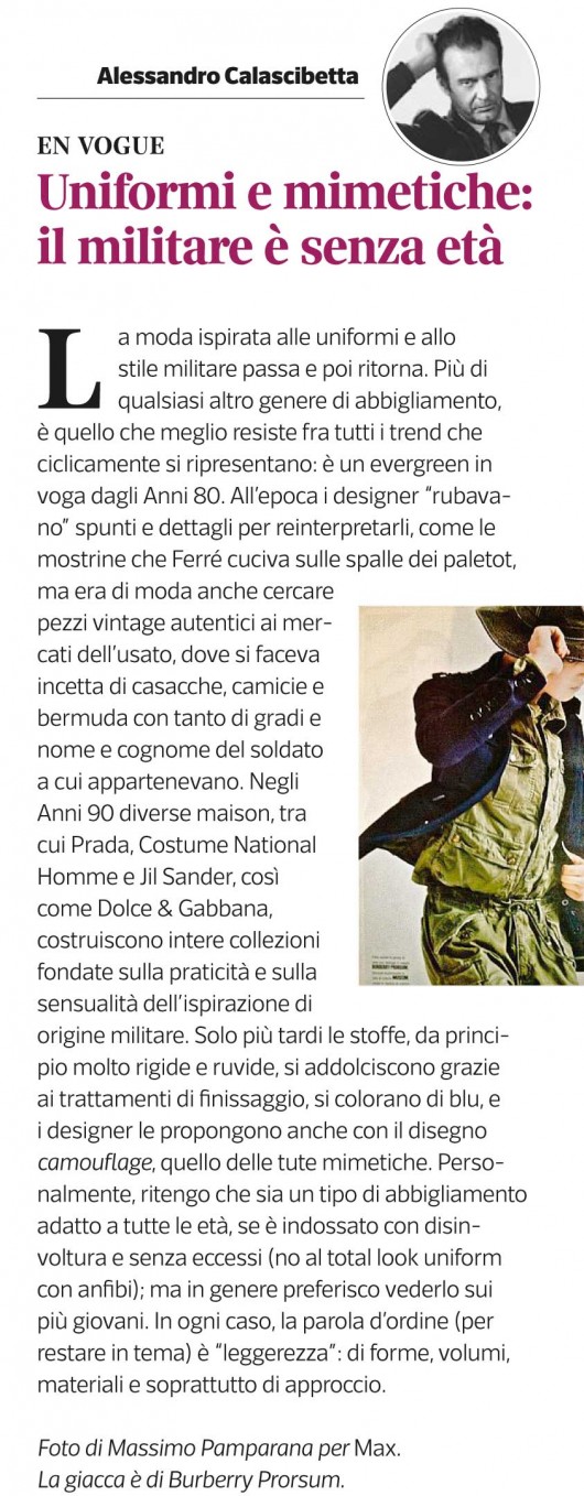
The military inspired fashion trend keeps coming and going. It’s persistent more than any other cyclical trend and an evergreen since the 80s. At the time designers used to “steal” details and ideas for reinterpretation, as the military badges Ferre’ has been sewing on the shoulders of his paletots. Became very popular to look around for unique vintage pieces at flea markets and snap up military coats, shirts and bermudas  with name, surname and rank of the soldier they once belonged to. In the 90s brands like Prada, Costume National Homme Jil Sander and Dolce & Gabbana, have been creating entire collections based on the sensuality and pragmatism of military clothing. The fabrics at first were hard and harsh but with the help of finishing treatments later on they became softer, blue and camouflage printed, just like combat uniforms. Personally I think it’s a style that suits everyone, when worn with confidence and without overdoing it (no to a total look uniform and combat boots). Generally I prefer to see it on young people. In any case the key word (sticking to the point) is “lightness”: of shapes, volumes and most importantly of approach. Picture by Massimo Pamparana for Max. Jacket by Burberry Prorsum.

L’UOMO VOGUE 1987

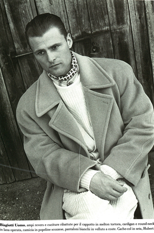
I love this picture because it has been my very first fashion shooting styled all by myself. After that, I’ve been worn the “cache-col” for a long time. Photo by Thomas Anders.

GOOD VS. BAD (STYLING) 3

L’UOMO VOGUE

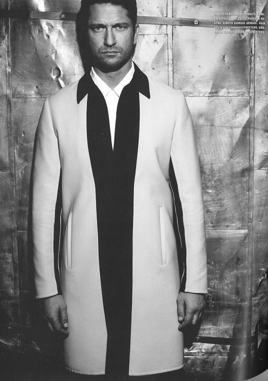
YES
Una bella foto e un ottimo styling: la moda è in armonia con il personaggio e l’ambiente.
Good picture and great styling: perfect balance between fashion, location and subject.

NO
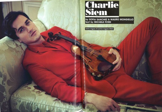
Non è sempre vero che un attore veste bene la moda: questo è un esempio.
Fashion does not suit every actor. This is an example.


ESQUIRE UK

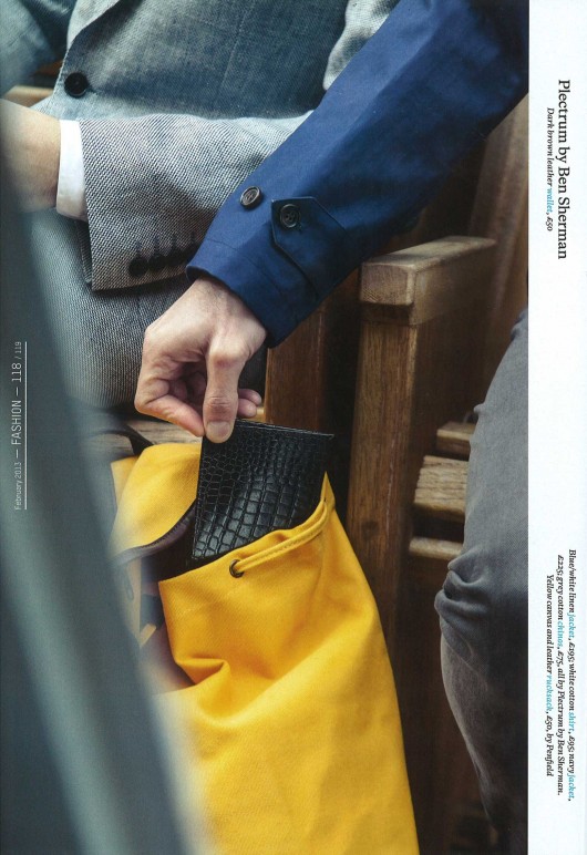
YES
Bella l’idea dello scippo per uno still-life/indossato; e lo scatto ha una bella tridimensionalità.
iI’s nice the bag snatch idea for a still life editorial.The shot has a good three dimensional effect as well.

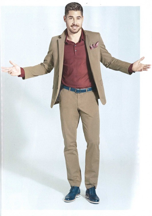
NO
Disastro su tutta la linea: pessimo il rever della giacca alzato, il fazzoletto nel taschino, il colletto della polo che sparisce sotto il blazer, le pieghe dei pantaloni e l’effetto “ponte” cintura/scarpe.
Complete disaster: awful turn up lapels, the handkerchiefs, the polo collar that disappeares hidden by the blazer, the wrinkled trousers, the belt-shoes “bridge effect”.

INTERVIEW

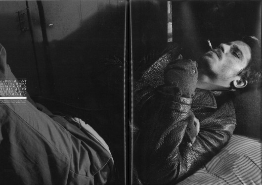
YES
E’ una foto che evoca un immaginario sensuale. L’impatto sa di vissuto ma – nonostante i guanti lisi e il materasso sporco –  riesce lo stesso a trasmettere un feeling di lusso understatement .
This image evokes a sensual imaginary, has a vintage touch and in spite of the worn out gloves and dirty materass, it gives a sense of understated luxury.

GQ UK

NO
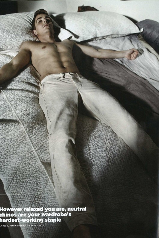
Se voleva essere una foto sexy, non sono riusciti nell’intento. Non è neppure elegante nè “speciale”.
If it was supposed to be a sexy picture it just didn’t work out. Is neither classy nor “special”.

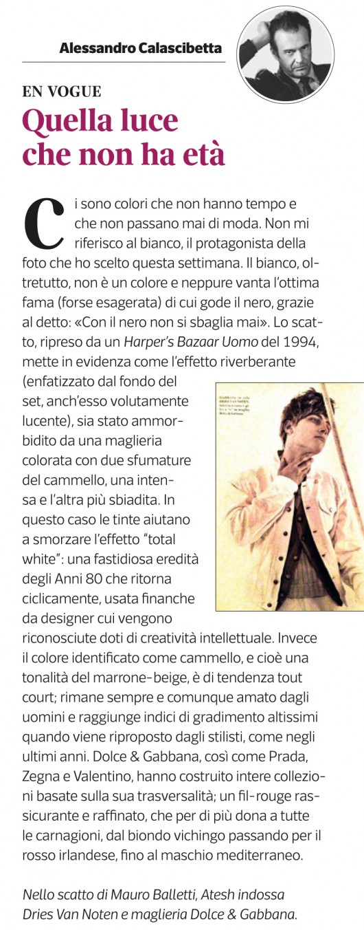
SETTE MAGAZINE EN VOGUE QUELLA LUCE CHE NON HA ETA’

Some colors are timeless and they never go out of fashion. I’m not talking about white, protagonist of this week’s photo. In fact white is not even a color, it also doesn’t have black’s (overrated?) reputation, because you know what they say “you can’t go wrong wearing black”. This picture is from an Harper’s Bazaar Uomo of 1994, it shows how the reverberation of light (already emphasized by a purposely bright background)has been softened by the use of two camel nuances for the sweater, one stronger than the other. In this case, shades can help mitigate the “total white” effect, an annoying 80s peculiarity which periodically comes back being chosen by designers with recognized intellectual creative skills. The color identified as camel (which is a shade of brown-beige) instead it’s simply timeless, is one of men’s favourite colors and is highly rated anytime brought back by fashion designers as over the last couple of years; Dolce & Gabbana, Prada, Zegna and Valentino have built entire collections on its transversality.It’s a refined and reassuring fil-rouge that fits every skin tone, from the blond viking through the irish redhead to the mediterranean male. Photo by Mauro Balletti, Atesh is wearing Dries Van Noten and Dolce & Gabbana knitwear.